

Let’s Explore, Create, and Grow Together!
Embark on The (Side) Quest: A journey into tabletop roleplaying games, storytelling, and beyond.

HOW DOES IT ALL FIT?
We don’t read RPG rulebooks the way we read novels.
We skim. We hunt. We flip pages mid-session (while your friend stares at you, waiting to roll the dice).
For any TTRPG designer writing game rules, adventures, or a setting supplement, there is this weird tightrope we need to walk. Our text must be both fun-to-read, imaginative, world-building fiction… and an easy-to-navigate reference document.
Setting, tone, procedures, rules, and story world flavor all have to coexist—often in very little space.
What does this mean? As a wannabe game designer, I often find myself staring at my laptop screen wondering, “How is all of this stuff gonna fit?”
So… in this post I’m looking closely at a page from two indie games: Nuclear Angels and Peasantry. They are both ambitious pages—chock full of clever ideas. I’m going to try to focus on the writing, formatting, and layout… exploring why certain things click, where the page struggles, and what moves I might borrow for my own projects.
Remember: I’m no level 10 layout wizard. This post is less critique and more study—an analysis through a Pro–Con–Con–Pro lens.
Let’s see what happens when a page has a lot to say.
CASE STUDY: Nuclear Angels
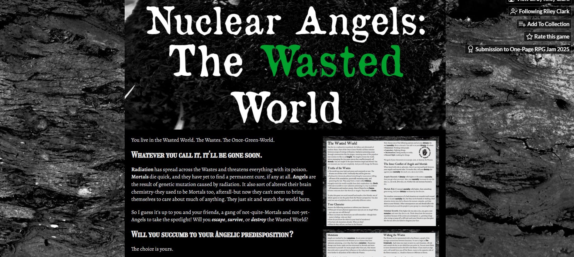
Nuclear Angels is a post-apocalyptic tabletop roleplaying game by Riley Clark (Substack’s Natural 7), created for the 2025 One-Page RPG Jam. It’s set in the radioactive wasteland where mutated (and uncaring) “Angels” control the “Wasted World” while the dying “Mortals” fight for what remains.
As is the case with one-pagers, every word of Nuclear Angels has to do a lot of work.
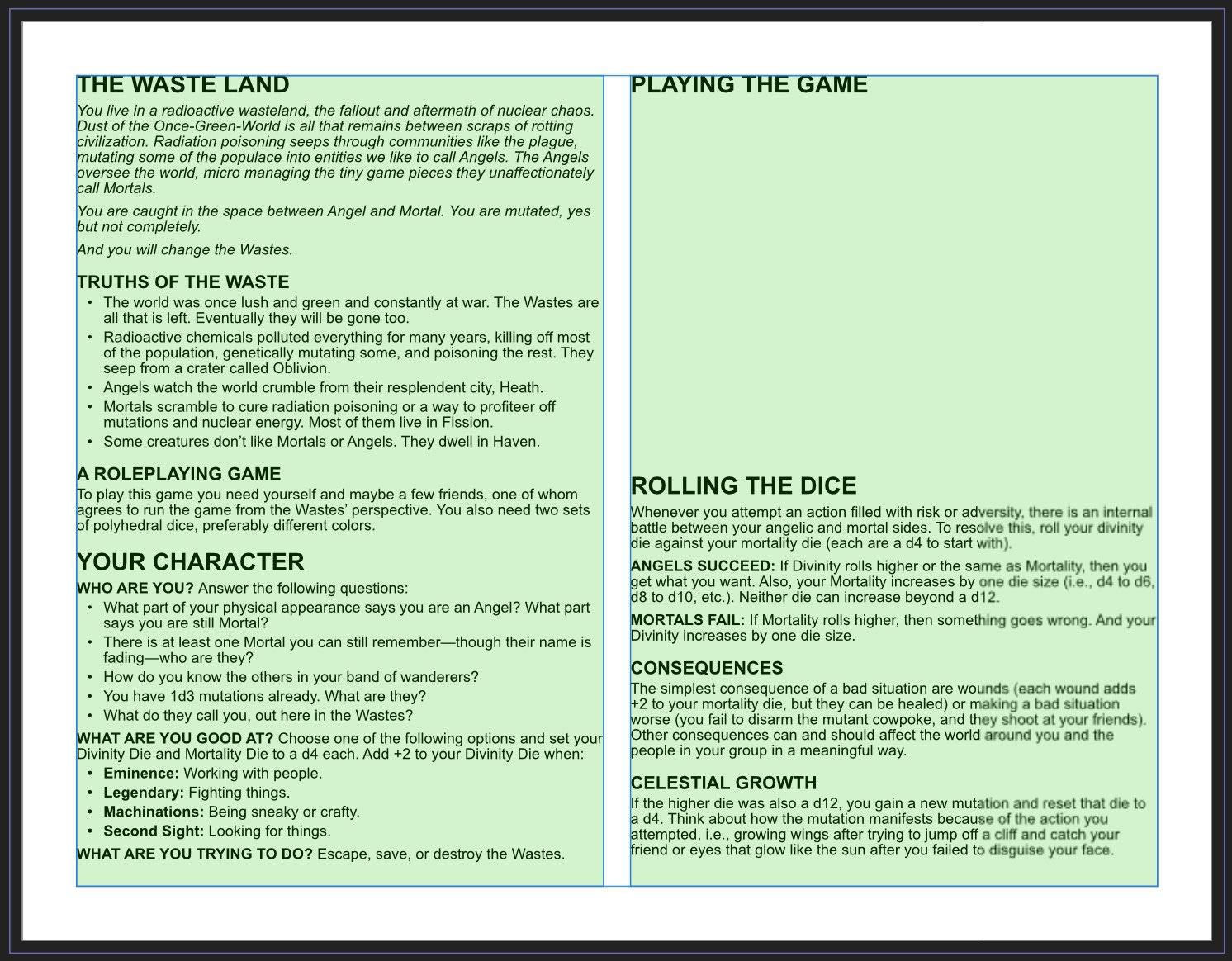
PRO: World Window
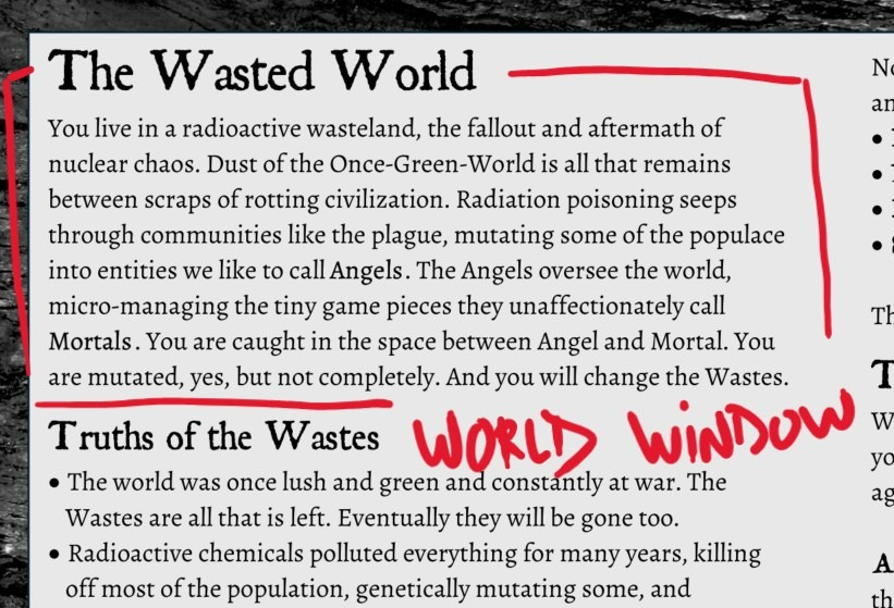
Nuclear Angels starts with a cool opener I like to call a “World Window” (check out “The One-Page Journey”).
You live in a radioactive wasteland, the fallout and aftermath of nuclear chaos.
This section pulls the reader in with some engaging imagery and establishes a setting.
Radiation poisoning seeps through communities… Angels oversee the world, micro-managing the tiny game pieces they unaffectionately call Mortals.
It hints at possible conflicts.
And you will change the Wastes.
And that direct address (second person “YOU” is the subject of the first and last sentence) thrusts the reader into the story world. You aren’t learning about the Wasted World… YOU are already there… and YOU will “change” it.
I must say, I also love the five “Truths of the Wastes” listed next (“The world was once lush and green…” etc.). These bullet points further support imaginative world building (I think The Lazy Gamemaster promotes this approach, and I dig it).
These truths are just icing on the cake, though. Clark’s World Window does a ton of heavy lifting… in only 84 words!
CON: Heading Hierarchy
While the writing may be confident, the formatting for Nuclear Angles doesn’t really help the reader navigate.
Take a look at the page.
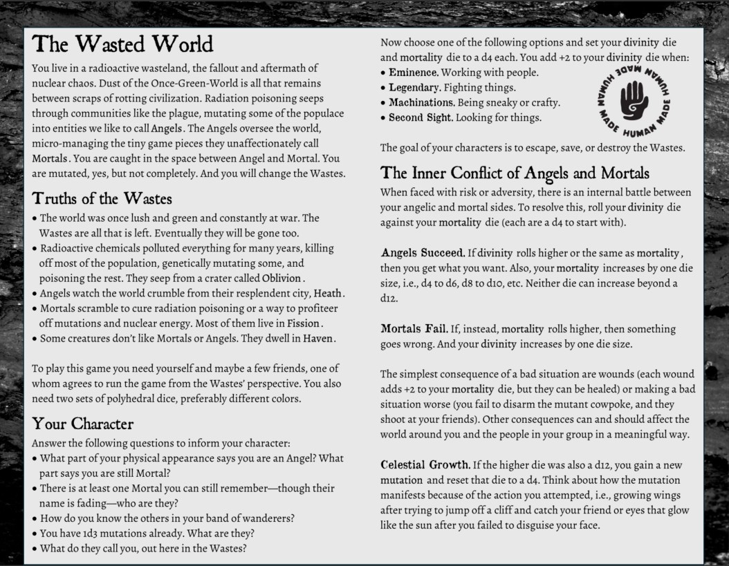
If I want to create a character, where do I look? OK… under the heading “Your Character.” Easy enough.
Alright, then… where do I find a concrete definition of the game… or what materials I might need? What is the goal/objective for the player characters? How do I resolve actions that involve “risk or adversity”?
All this is actually right there in the text, but you’d have to almost completely re-read Nuclear Angels to locate it.
Sure. There are some headings (and there are spaces that, kind of, signal “new section”). I’m not really sure if this guides the eye, though. And notice how the “Your Character” section at the bottom of column one continues at the top of the next column. This stops the reading flow.
I’m thinking a few more headings (or some subheadings) would help.
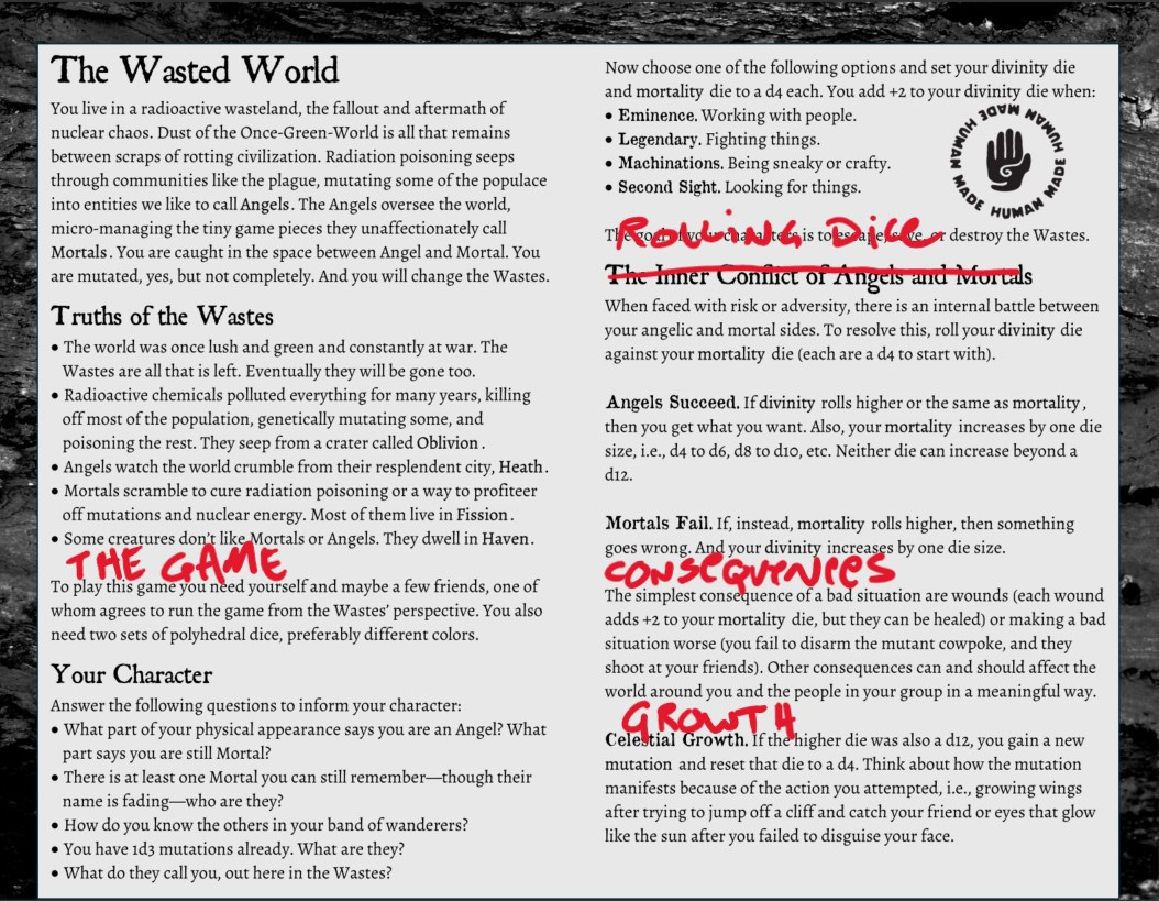
Without a clear heading hierarchy, most of the text has the same visual weight. Even with intentional spacing, it doesn’t feel as if the page groups like-things together.
The reader has to do their own organizing, and that’s not ideal.
CON: Overcrowded Page
OK, so the heading hierarchy is incomplete, but the main weakness for Nuclear Angels, one that immediately jumps out at me, is that the page itself is just too tightly packed.
Empty space is almost non-existent. The page feels compressed… like it can’t breathe.
It’s a one-pager… I get it! There is so much that needs to fit in that single sheet of real estate… but empty space feels important to the reading experience.
How do we fix this?
Before I could figure this out, I had to throw the text into Affinity Publisher 2. Once I got in there and moved some stuff around, I was able to imagine a possible solution.
Here’s my changes:
Font: I set the body and bullet point font to Arial size 10 pt. (Arial is strictly for the purposes of the experiment… I realize that Clark’s choice of font better supports the game’s tone/theme). Heading One is 16 pt. and Heading Two is 12 pt. (both all-caps and bold). When Heading Three was needed, I just used the body text all-caps and bold.
Page: This is a standard 8.5 x 11 inch sheet of paper with all four margins set to .5 (and a .118 inch/3 mm bleed). I got rid of the background image. That slag rock did a little bit of world building, but it’s worth the squeeze it places on the page.
Spacing: I chose Affinity’s default line spacing (for 10 pt. font = 10.3) and placed a 5 pt. space between connected lines and a 10 pt. one between new sections.
Columns: I tried to keep the game’s original two-column approach, but I made the gutter separating the two at 0.25 (inch).
What happened? I was able to group like things together (now the “Your Character” section is all together). The page is easier to navigate/reference. And… surprisingly I found enough space for entirely new section. This could be a brief “How To Play” that defines the roles of player and GM (or even an image).
PRO: Game Terms
One more positive thing: I really love how Nuclear Angels uses these clever terms for its four character skills.
Eminence — working with people
Legendary — fighting things
Machinations — being sneaky or crafty
Second Sight — looking for things
Eminence could be “Charisma” and Second Sight “Perception.” But Clark here gives labels to reinforce the game’s themes. These four carefully chosen words help the game create a distinct player experience.
With a 200 page rulebook, you could argue this doesn’t matter as much. But, like I said, with a one-page RPG… every word counts.
CASE STUDY: Peasantry
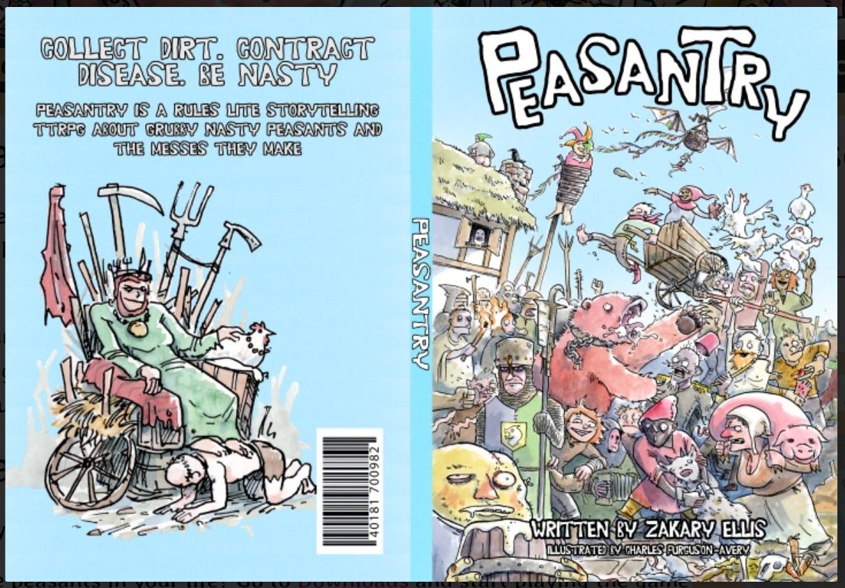
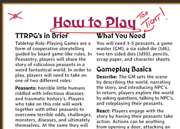
On to our next example: page six (“How to Play) from Peasantry, a comedic fantasy tabletop roleplaying game by Zakary Ellis. Players take on the roles of (deeply UN-heroic) villagers trying to survive life in the Middle Ages through cooperation and, well… bad ideas.
PRO: Clear Headings
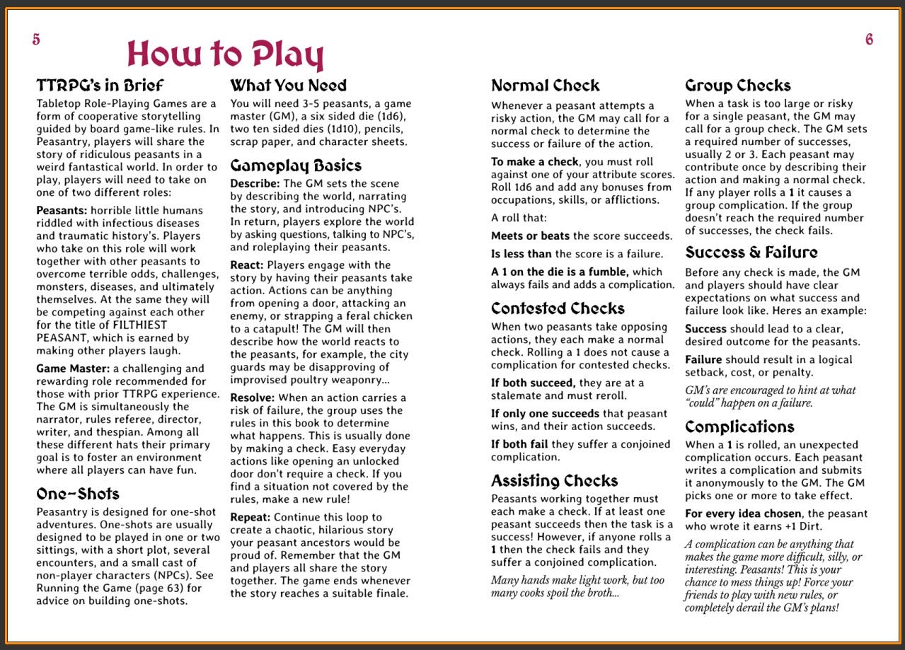
This page from Peasantry is easy to navigate. Headings like “What You Need,” “Normal Check,” and “Success & Failure” guide the reader through the page (or back to it… if reference is needed). Line spacing has been used to group like-things together visually.
Check out “Gameplay Basics.” I like how the core loop is listed in bold: “Describe, “React,” “Resolve,” and “Repeat.” These subheadings are simple, but easy to spot and concisely (memorably) written.
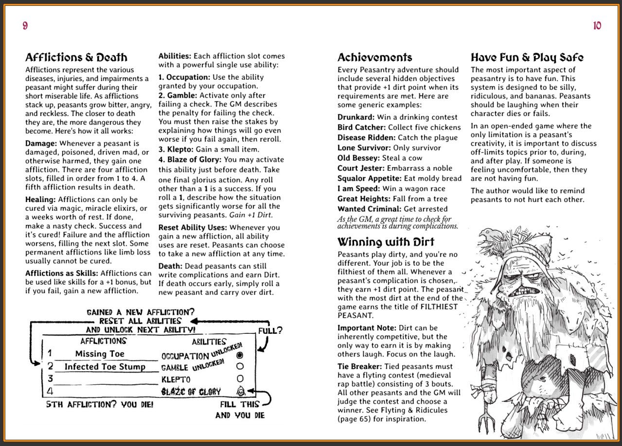
CON: Instructional Order
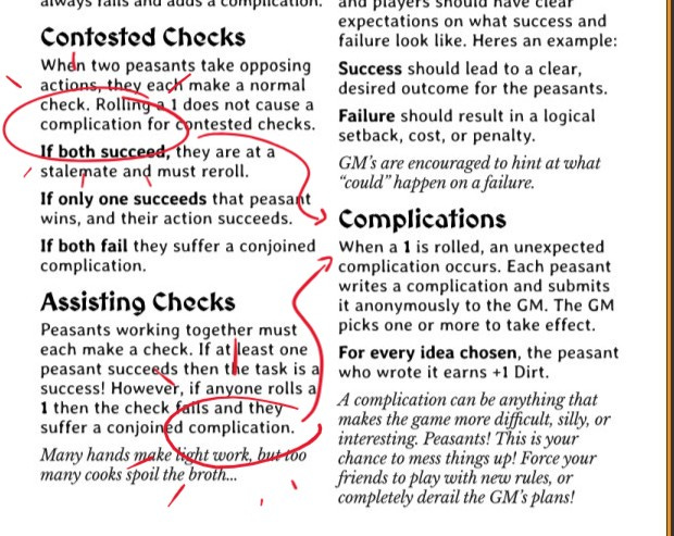
“Complications” are referenced under the various “Checks” sections, but they are defined afterwards. This might trip up even the experienced TTRPG reader.
I would argue that to create a clear learning path, one that teaches your players “How to Play” step-by-step, it’s important to never use a term before it’s been defined.
Ellis could fix this by simply moving some sections around.
CON: Overcrowded Page
Oh boy… here we go again. Despite its clean layout, this Peasantry page still feels stuffed—just like Nuclear Angels. White space is better, but still minimal… and nearly every column inch is occupied.
I mean… if you’ve ever tried to apply your text to a layout, this is no surprise.
How do you fix this?
The margins are already at half-inch. Font size is good, should not be reduced. I dug into the text and couldn’t find anything that I would absolutely cut.
Without looking at the actual file (Affinity Publisher or Adobe InDesign, etc.), it’s hard to say—perhaps the page size could be increased? Or… could we just add more pages… spread things out?
If Ellis didn’t want to mess with all that (and I don’t blame him), I would at least fix that section title. It’s just too close to the body text.
Peasantry has well-written info here, but the page could be overwhelming, intimidating. Take a look at another page. Even with some amazing art (by Charlie Ferguson-Avery), it still feels like too much for the page.
PRO: Writing Voice
For me, one of the best things about Peasantry is that it’s a joy to read.
The game’s voice comes through constantly.
What could just be procedural/informational text also reminds players that they are “ridiculous peasants” and supports the game’s tone.
Actions can be anything from opening a door, attacking an enemy, or strapping a feral chicken to a catapult!
Not every line of the page mentions “improvised poultry weaponry,” but you can tell that Ellis is injecting this humor wherever he can, and it’s just… entertaining.
The humor here isn’t just flavor. It’s guidance! These little weird examples help explain the rules, but they also let players know what kind of story the game supports.
AMBITIOUS PAGES
A while back I asked my Substack friends: “Give me a page or two of your rules, adventure, or tabletop roleplaying game setting… and I’ll give you the old Pro-Con-Con-Pro in a future blog post.”
My thanks to Riley Clark (aka Natural 7)…
…and thanks to Zakary Ellis for generously volunteering their work for a (Side) Quest analysis. It’s no exaggeration: their openness (and courage) to criticism has helped us all grow as designers.
Looking at these games side by side, it’s clear they’re responding to the same, stubborn obstacle we all face: trying to do a lot in very small space.
What stands out on the page, however, gets used at the table. What gets buried risks being forgotten (or frustratingly searched for) once the dice get to rolling.
Here’s what I’m carrying forward into my own designs thinking:
A strong “World Window” matters.
Headings should guide, not just label.
Word choice and a stylistic voice does real design work.
Instructional order matters. Define terms before you use them.
White space can be instructional. It can create a more enjoyable reading experience. It’s not just decorative.
But… what’s the main thing I learned?
Ambition is a good problem to have.
We create dense pages because we’re trying to give players a great experience—and that’s OK. However, the way our information is written, spaced, and organized on a page shapes what excites players… what they remember… and what they use at the table.
Sometimes we just need to back up, rethink, and edit.
Easier said than done.
What are your struggles when it comes to writing, formatting, and/or layout?
Biggest issue for me is the description text for a keyed room. It’s so hard to cut down the prose. I like my descriptions haha. I guess the “kill your darlings” applies. Would love to get your opinion on a free dungeon I’m making for Shadowdark.
First, this continues to be an amazing project you've embarked upon, and I can't wait to assign some of these essays to students in my narrative games course in the fall. I had already planned a discussion of design and layout, but you have really led the way here.
As someone who is also a big fan of white space—and trust me I say I have seen it absolutely murdered way too many times—sometimes crowding it isn't necessarily a bad thing. I would rather, for example, turn to a page spread crowded with information than to one that was had two half pages of text and two overly large illustrations, especially when the illustrations are mostly vibe-driven. (To be clear, I understand this is a preference not a rule.)
What I like about what you are doing here is making it clear the readability matters and that you arrive at readability through several dimensions: prose that is both clear about the game mechanics but also evocative of what the game is about, layout that makes the structure of the text (and thus of the game) clear and easy to reference (especially during that first play), and design that reinforces all of these things, from choices of type face to thinking about non-textual elements.
Thanks again!